Have a nice example of well-set type? E-mail it to Peatah! Also, send us your reasons why it’s a nice example and its source.
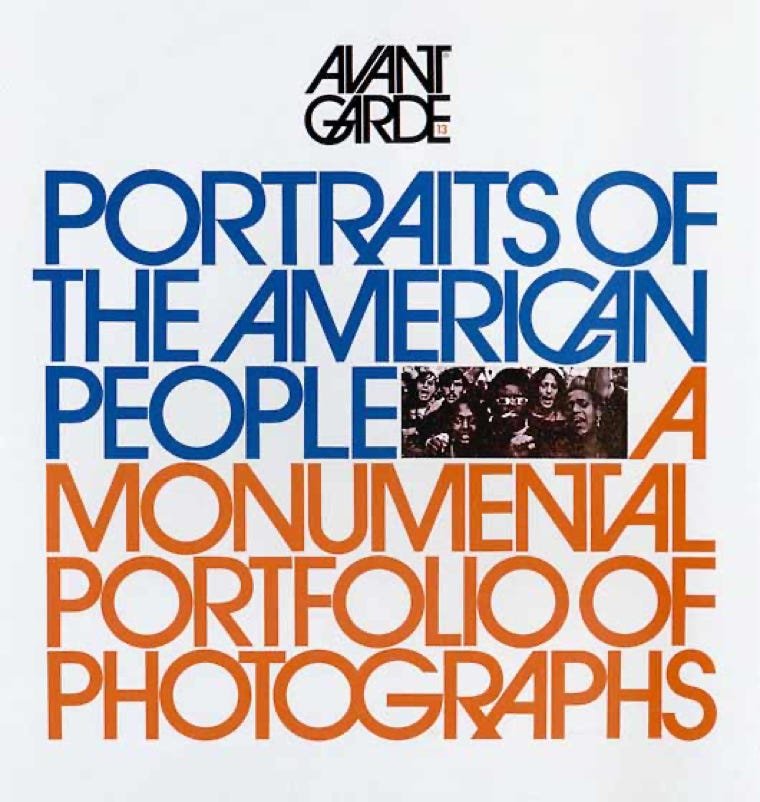
Herb Lubalin.
Sorry, but I just couldn't
go on with a discussion
of outstanding type
without having at least one
example from this master
of phototypography.
Intrigued? Learn more
about Mr. Lubalin here:
This image is the cover of Avant Garde magazine #13, published in 1971, and art directed by Lubalin. Image from a book on Lubalin published in 1985 by
American Showcase, Inc., New York City.
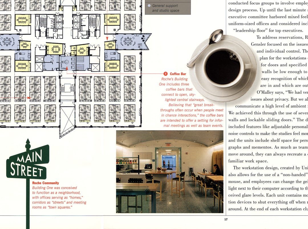
Contrast and integration.
Notice how changes in color and typeface make obvious cues for image captions and body text.
Also, note the text wraps and positioning to lead the reader through and to integrate type
and image in the layout.
This is a portion of a spread from
@issue: The Journal of
Business & Design.
This previously printed publication
currently lives as a blog at:


Entire site and content © Copyright 2023 Kerry Scott Jenkins. All rights reserved.