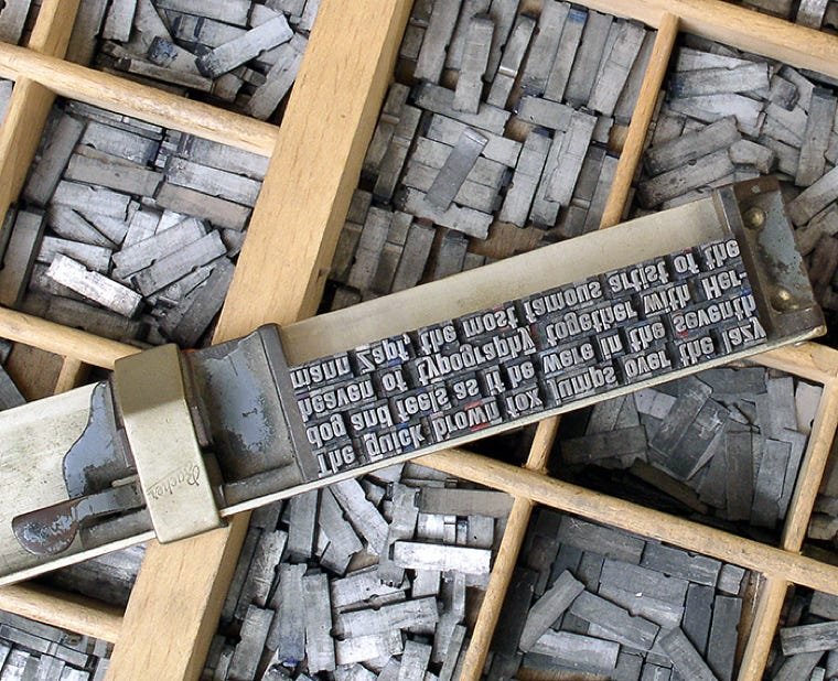
Measure Up page title graphic
Back arrow to the Teachings page
Peatah gold sticker button


Measure Up: Basic Type and Typesetting Measurement.

Type case with metal type photo


Type Case

Metal type glyphs: caps stored in the top, small letters in the bottom
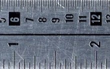
Pica ruler image


Pica Ruler

1 inch = 6 picas = 72 points

Line weights compared


Line (Rule) Weights

from top to bottom:

1, 2, 3, and 4-point rules


Point Size

is a measurement that would include room for all the caps, ascenders and descenders.


Point Size

left: Times; right: Helvetica
Both are the same point size.

Graphic to show point size measurement
Times and Helvetica comparison

A standard system of measurement within typography came about in the late 19th century. Prior to that, different type foundries had different ways of measuring their type. So, mixing type from various foundries was difficult.

What’s unusual is not so much the measurement system, but that terms from these metal type days are still used today. “Leading” just doesn’t seem like the right choice now to us whippersnappers.

But I appreciate this. The nostalgic vocabulary helps to instill the history of this craft. And Peatah’s mission is to promote the artistry of type—no matter the technology.

Let’s start with some basic terms of measurements illustrated at the left.

You can see from the short (but enlarged) section of a pica ruler the normal inch measurement on one side and picas on the opposing side. The smallest tick marks across the top represent 2 points each. So, 12 points in each pica, and 6 picas per inch.

Picas and points are used for measuring all things type, plus more. The next image down shows we also measure line weights (aka rules) in points.

So, how do you measure type? If you set Helvetica Bold, 18 point, are the capital letters 18 points high? No. This is a point of confusion since this system comes from the metal type days. Metal type is cast—letter by letter—on individual blocks. All the blocks of a specific point size typeface are all the same height. So, the blocks all have to be tall enough to contain the caps, the ascenders, and the descenders. Look at the red lines above and below the Teachings lettering at left. These represent the top and bottom of the type blocks. Each block has to be uniform in height so that the font has a consistent baseline. See how the ascender on the lowercase h extends higher than the capital T?


The point size is based on the height of the type blocks. Some typefaces have tall ascenders or long descenders. Some typefaces have taller x-heights or wider characters. This means the same word set the same size in two different typefaces may look as if they are two different sizes. (See the Times Roman and Helvetica 55 Roman “type” examples at left.)

Okay, let’s get to that “leading” explanation ...

Photo of metal type in case
Leading example 1


This one is set solid, 27/27.

This represents the point size

and the leading and is read as

“27 over 27”.

Leading example 2


This one is set 24/28.

Leading example 3


This one is set 24/20.

With photoset or digital type,

we can have lines of type that overlap into another line’s

space, as shown above.


Above is an image of metal type. If you look closely at the four lines of type in this composing stick, you can see the individual type blocks for each character. You can also see that the four lines are directly placed against each other. This would be called setting the type “solid.” If the typographer wants to have the lines of type spaced further apart, actual strips of lead are inserted between these lines of type. The thicker the strips of lead, the more space between lines. This is appropriately called leading. Word processing programs today may refer to this as line spacing or line height; but page layout programs refer to this as leading.

Look at the examples at the left for variations on leading. By the way, these are all actual newspaper headlines!


Let’s look at spacing, line measures and the like.


Line lengths for typesetting are measured in picas. Typographers have to take care in deciding line lengths for body text. If your column is too narrow, words may be hyphenated more frequently than you want, or readers’ eyes may grow tired from darting back and forth more times than normal.

Conversely, if your line length is too wide, readers may stumble to the next line while they read—the extra distance makes it hard to know which is the next line.

So, how do you decide how wide to make your columns? There are many opinions, but here is my way that works well and doesn’t require a ruler:


Set a line of type using the typeface and point size you want. Make it lowercase and type the whole alphabet—a to z—twice like this:

abcdefghijklmnopqrstuvwxyz abcdefghijklmnopqrstuv wxyz

Your column width should fall somewhere between one-and-a-half to two times the width of the lowercase alphabet. The two alphabets above—set at 25 point—meet the requirements!

Up arrow to top of Measure Up page

Entire site and content © Copyright 2023 Kerry Scott Jenkins. All rights reserved.